Why every therapist website looks the same (and what it's costing you)
LAUSANNE, Switzerland —
Open a new tab. Type “magnetism healer”, “reflexologist”, “naturopath”. Open the top five results.
Close your eyes. Open them again.
You already know what the next one looks like.
Pastel mandala in the hero. Photo of hands in golden backlight. Elegant script font on cream background. The sentence “I accompany you on the path to…” in italics. A contact form buried at the bottom of the page — often broken on mobile.
It has become the default visual of an entire industry. And like all defaults, it makes you invisible.
What it costs you (concretely)
1. Your patients stop remembering you
A new client comes through a referral: “go see her, she’s amazing, hold on I’ll send you her name.” Except in the meantime, they’ve googled four practitioners before yours, and all five sites look so alike that they mix up your info with the naturopath down the street.
Result: they call the wrong one. Or worse, they book a slot with you thinking you do something else.
In a field where trust is built on immediate recognition, this confusion has a real cost.
2. You get fewer calls than your experience deserves
You have 10 years of practice, dozens of loyal clients, exceptional feedback. But when a new visitor lands on your site, nothing signals it. Your expertise drowns in the same layout as someone who opened their practice 6 months ago.
Your site should carry your seniority. It dilutes it.
3. You lose 6 hours a week on your calendar
How many texts to reschedule an appointment? How many WhatsApp messages “hi, is Thursday 2 p.m. still available?” How many times have you jotted a slot on a sticky note and then forgotten it?
As long as your schedule lives in your head and your phone, you’re doing two jobs: therapist + secretary. The second steals hours you can’t bill.
Three solutions (and Marcia’s case)
Marcia Nunes, a magnetism healer established in French-speaking Switzerland for 20 years, lived all three pains above. Here’s what we changed together.
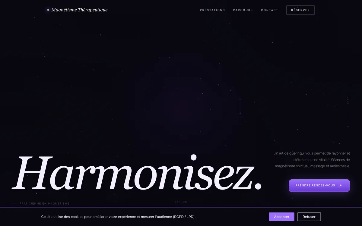
1. A visual direction that owns itself
In a pastel-saturated industry, we went the opposite way: deep plum, nocturnal violet, amber gold for pricing, DM Serif Display in cinematic italic. The site speaks of mystery without being scary and of rigor without being clinical.
Result: when a patient shares her URL, nobody mixes her up with another practitioner. Visual direction does 80% of the differentiation work, before any content is even read.
2. An “About me” page that actually says something
The classic pitfall: either the page overflows with personal confidences, or it reads like a resume. We aimed for an editorial middle ground: an assumed portrait (not a blurry photo in hide-mode), a first-person text that describes the why of the craft, and a side box that explains magnetism in 2 paragraphs for those arriving without context.
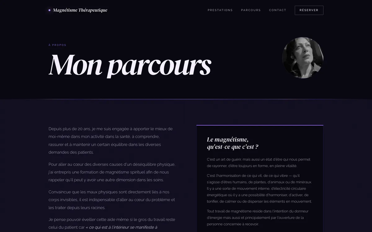
The visitor understands what she does, why she does it, and why she’s the one they want to see — in 60 seconds of reading.
3. A booking system that frees her calendar
We built a booking system directly into the site: interactive calendar, dynamic slots, dates automatically blocked on her unavailable days. The client books, Marcia gets an email, she accepts with one click → the patient receives the confirmation automatically.
No more texts. No more sticky notes. No more “is 2 p.m. available?” Her dashboard shows the week at a glance.
Time saved in the first month: 6h/week. That’s one working day per month she can give back to her patients — or to herself.
Test your own site
Three questions to ask yourself right now, looking at your site:
- If I blur my name and logo, does someone I know recognize this is mine? (If no → differentiation problem)
- Does someone unfamiliar with my craft understand in 30 seconds what I do and for whom? (If no → editorial problem)
- How many texts do I get per week to book or reschedule? (If more than 5 → tooling problem)
If you answered “no” or “yes, too many” to any of these, your site is costing you more than you see.
Let’s talk?
I offer a free 15-minute audit to any independent practitioner: I look at your site, I give you 3 priority improvements and an estimate of the time you’re currently losing. No obligation.
See Marcia’s full case: magnetismetherapeutique.ch · Detailed case study →